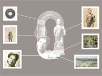
Realising that many people knew very little about our collections, an idea was launched to adopt an everyday language.
Working closely with the State Library, Design agency Frost* came up with a way to take fragments of visuals of our collections and compose them into letters of the alphabet. This creative process began with O, U and T, and so began our campaign to take the Library OUT into the community.
 For instance, the O is made up of:
As you can see, so many parts of the collections add shape and interest to the alphabet.
Frost* went on to produce the whole alphabet which not only took some of the most unknown images of the collections but also the very well known images, playfully putting them together.
Our own alphabet is being used throughout the Library in many surprising ways, taking our collections OUT to the community.
These letters and numbers engage our audiences on a journey through the treasures of the collections of the State Library of New South Wales and the Mitchell Library.