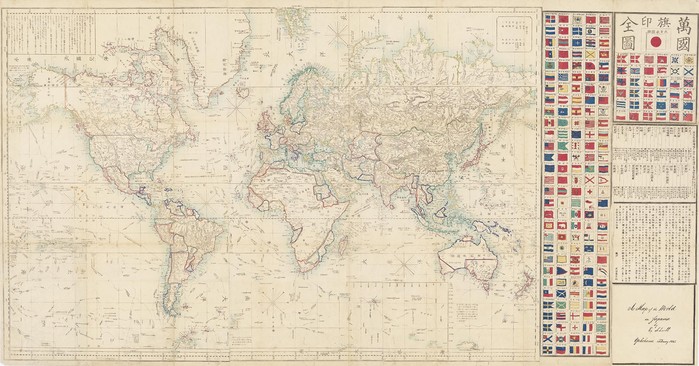
Japanese maps are known for their exceptional beauty and high quality of workmanship. This chart is a fine copper engraving, with the original hand colouring, measuring 84 x 129.5 cm. The accompanying text is written in traditional Sino-Japanese characters and explains that the map was based on an earlier one by John Purdy around 1845. The accompanying text also includes a chronological list of explorers and the flags of over 150 foreign nations.
This map was produced for a Japanese audience but uses traditional Western cartographic conventions and historical content including the routes of significant explorers such as Cook, Vancouver, La Perouse and Flinders.The publisher, Edward Schnell, was a Dutch-German arms dealer who lived in Japan in the 1860s.
This was a period when Japan was gradually lifting restrictions on foreigners, encouraging trade and opening communication with the west. This map is one of the first Japanese maps to be based on the Mercator projection. The first Mercator based map, a new world map on Dutch sources, also held by the Library, was produced only a few years earlier by Seiyo Sato in 1857. European cartographers had been using the Mercator projection routinely for over a century and Mercator had introduced the concept back centuries earlier in 1569.
Previous Japanese mapmakers had used a hemispherical projection for world maps.From an Australian perspective the map contains a curious set of divisions in blue and red ink with New South Wales, Victoria, Tasmania and most of South Australia in one section. Queensland, most of the Northern Territory and Western Australia are drawn into another section.
The south western part of Western Australia is sharply separated along a diagonal line. The northern most part of the Northern Territory, from the Gulf of Carpentaria to the approximate area of Quion Island, is shown in a separate section or boundary.These divisions are curious. By 1860 the current state boundaries used today had been firmly established and these formal state boundaries are reproduced in many Australian maps printed in the mid nineteenth century.
There are also a number of geographic features within the borders that would have been explored in more detail by 1860 for example, the blue crescent shaped depiction of Lake Eyre.Japan's isolationist policy kept most western maps from reaching Japan so even 19th century maps appear extremely out of date. This provides an explanation for the inaccurate depiction of Australia.
It is likely that the Purdy map which was used for this chart was a reissue of a map produced by Purdy in the 1820s. This would explain the red and blue division as crudely reflecting the settled and unexplored or surveyed regions of Australian around 1820.Intended for a Japanese audience, this map was hopefully not the only source of information for the small number of Japanese travellers departing the country.